Wednesday, July 22, 2015

Value Stream Map - Part 4: Material Flow


Remember, a Value Stream Map should be communicating to you and  to your organization.  So far we’ve examined how the flow chart and data boxes communicate.  Now we’re going to examine how the supply and delivery icons communicate.

On the top left are the supply icons.  They tell us who the major suppliers are.  In the case of Acme Fire Suppression, Inc., the two major suppliers supply the steel blanks for use in the Upset operation and the chemicals used in the Auto Fill operation.

We know from my earlier description of the process that there are other supplies used in the process, e.g. the paint, the inert gas, the spray nozzles, cardboard overpack and boxes.  None of those made it onto this VSM.  The reason is mostly because they’re commodities, and easily available.  We just want to look at the high $ items, or the items that could potentially shut us down if they weren’t delivered in a timely fashion.

So, looking at the steel blanks, what do we see?  Well, at the top we see that we’re getting two different types of blanks: the 5 pound and the 10 pound.  We can see they come from the same supplier (normally the name of the supplier would be in the factory symbol).  Finally, we can see that we get shipments of 14,000, 5# blanks and 8,500, 10# blanks.

Next we see that the steel blank supplier delivers twice a week.  And, we see that we keep a 20 day inventory of their blanks at all times.  One should logically ask why we’d inventory 20 days worth of these blanks when they have the potential to deliver twice weekly.  Good question.

Next let’s look at the chemical supplier.  They are shipping 35 super sacks of the chemicals a month (each super sack weighs 1,000 pounds).  The same chemical is used in both the 5# & 10# extinguishers.  Meanwhile, Acme keeps a 25 day inventory of the chemical.  

Now let’s look at the delivery side of the VSM.  From this diagram we see that Acme ships out of their warehouse once a month.  Each shipment contains 40,000 5# extinguishers and 24,000 10 # extinguishers.

Again, this is all just data at this point, but it’s also something we call Actionable Information.  By that we mean that we have enough information to actually make decisions and formulate action plans.

Case in point: why would Acme only ship once a month and keep a 30-day inventory of fire extinguishers?  Doesn’t that violate at least one of the 7 wastes?  Armed with that information, what actions might that lead Acme to make?

Friday, July 17, 2015

Value Stream Map - Part 3: Information Flow


Perhaps one of the least well understood or appreciated parts of the Value Stream Map is the information flow at the top.  That said, it’s an important part of the entire flow of a value stream.  There is much to be learned from it.  Let’s examine.

COMPANY (Production Control) BLOCK:  Let’s start at the Company block, top center.  Here we note the Name of the company being studied.  If there are multiple value streams in this company, you may also list the value stream's name.  In our case, the company's name is Acme Fire Suppression, Inc.  Also here we’ll indicate who is at the Hub of the Information flow: Acme’s Production Control office.  It's rare that production control does not control the flow of production-related information.


Finally we note whether our processes are all manually scheduled or computer scheduled, and what type of scheduling tool is bing used.  In our case, processes are being controlled by a Material Requirements Planning (MRP) software program.  That bit of information alone tells us volumes.

COMMUNICATION FROM CUSTOMER:  Recalling that, by convention, the Customer is always on the top right of the VSM, we see that Acme’s customer is providing them with three separate forecasts.  First, there is six month forecast of their needs.  

This forecast is “squishy,” in that it only gives us a guess of what our customer really intends to buy.  Sales can use this forecast and we can develop an estimated Takt Time from it, but we really shouldn’t spend money or commit resources based on this forecast.  The reason for that recommendation will become evident when you see the monthly order.

The semi-annual order is a little more firm, but still nothing you can sink make long-term plans around.  Even the monthly order represents a target value.  Implied in this order is the hope that this order quantity will stay the same from month to month; however, the contract with the customer has provisions in it that allows them to alter this standing order, up or down, by as much as 50% in any month.  

If you think about it, that’s a lot of potential fluctuation.  Only when the final, amended, order arrives can we really schedule the month’s production.  The amended order alone gives us "actionable" information.

COMMUNICATION TO SUPPLIERS:  Now let’s look at what Acme communicates to its Suppliers.  Again, by convention, supplier information is found on the top left side of the VSM.

Like their own customer, Acme gives their suppliers as much of a view of the future as they can; so, they send suppliers a six month forecast.  As I said earlier, this is just a guess for planning purposes, but nothing the supplier can hang their hat on.

Next, Acme sends suppliers a two week forecast.  This is getting firmer, meaning that Acme knows they’ll be close to actually buying these quantities.  Then comes the weekly shop order that gives suppliers specific quantities to produce and ship.  Finally comes the daily priority list that gives Acme the ability to tell suppliers the order in which they want materials made that day.  

One might well ask why the daily list when there are only two shipments a week, but this is Acme’s way of projecting consumption by their own factory.

Seem confusing?  At least it’s all documented!  From a well-documented process you can make corrections that will improve it.

This VSM is likely the only place in a company where all this information exists in a single place.  Think about the implications of that.  If no one has been looking at all this, on what have decisions been based?

In the absence of such cross-functional communication many organizations fall into silo behavior, where everyone does their own thing, ignoring its implications on the rest of the organization.  By contrast, imagine if all departments worked from a single sheet of music that was updated on a timely basis.

INTERNAL COMMUNICATION:  We have one more flow to follow, and that’s the flow within Acme.  This one is easy.  The VSM shows us that once a week, the MRP systems sends ("pushes") shop orders to each operation in the value stream.  Each shop order is an order to “build,” instructing that operation in what they are to make, in what quantity, in what order and when it’s needed.  

One thing common to all communication in this Current State map: it all is pushed.  There is no feedback loop or any sense of give and take to the flow of information.  Especially in the factory.

Keep in mind:  When every operation is being scheduled, even though some operate at very different cycle times, MRP-generated schedules almost always lead to products being “Pushed” and a lot of WIP (read: excess inventory).

I’ll end the discussion of the information flow here, but can you start to see how densely the VSM is packed with information?  As I said earlier, this is information rarely found in a single place anywhere else in an organization.  Once you’ve made the effort to document it, you’ll want to keep the VSM accurate by updating any changes.

Next, we’ll examine the flow of raw material and finished goods.

Monday, July 13, 2015

Value Stream Map - Part 2: The Data Box


In the picture at the top of the page, you can see both flow chart (discussed in my last post) and the data boxes below them.  I’ve included the flow chart in that picture, because the data boxes are linked to specific operations and paint a compelling story of that operation.

So, what is this story the data box tells?  

First what goes in a data box needs to be tailored to the value stream being mapped.  I’ve used five standard metrics, but they might not work for your business; or, your business may need to add another measure specific to your industry or process.  

CT - Cycle time is a critical measure of any operation.  It tells us how long it takes to complete one iteration of that process step.  It’s important, because, when compared to Takt Time (TT) we learn immediately whether we can meet customer demand.  Remember, CT must be less than or equal to TT if we’re to meet our delivery commitments on time.

C/O - Change Over time is the time between making the last good piece of a previous product and the first good piece of the new one.  While sometimes referred to as SMED (single minute exchange of die), many industries don’t employ dies.  Also, it’s not just about changing a die, but about taking whatever measures are necessary to make the first good part of the new product.

AT - Available Time is the time operators have to actually work each day.  It’s the time between when they arrive and when they leave, less any time spent on breaks, lunch, meetings, clean up, etc.  As you know, available time is a key component of calculating Takt Time.

Defects - This is pretty self-explanatory.  We’re trying to get an idea of how reliable the process at this operational step is.

Uptime - This is the measure of how reliable machines used in that process are.  Calculated by subtracting machine down time from 100%, Uptime gives us an idea of where we have problems with equipment.  There is a much more comprehensive measure called OEE, and I'll deal with it in a later post.


CONSIDERATION:  When you have multiple machines or multiple operators covered by a single data box, you need to make the decision how you’re going to calculate data values.  Some average the values.  I believe that creates misconceptions about the process.  I elect to post the worst data.  You’ll understand why when I later discuss how to use your VSM to determine where to deploy your lean assets.

Monday, July 6, 2015

Value Stream Map - Part 1: The High Level Flow Chart


There are some wonderful books on this subject.  I have no desire to compete with them, but I would like to break open this extremely important and underutilized tool.  In essence, let's look under the hood and see what this thing's all about.

Here are my goals:
1. Explain each segment of the Value Stream Map (VSM)  
   A. High Level Flow Chart
   B. Data Boxes
   C. Communication Flow
   D. Material Flow
   E. Value Add vs. Non-Value Add
   F. Importance to decision making
2. Explain the way to use this tool as an ongoing guide in allocating your Lean resources

Let’s start with the High Level Flow chart.


What you see above is a high level flow chart.  It’s high level because it only depicts the major operations that take place in the making of a household fire extinguisher.  

The flow starts on the left with “Upset” and flows to the right.  We know this by following the directional arrows between steps.  It's also the convention of Value Stream Map (VSM) construction

These directional arrows tell us one more thing.  Because they are straight and dashed, we know by VSM convention that material is being “Pushed” to, not “Pulled” by, the next operation.

At the “Upset” station, a steel billet, the size of a shuffleboard disk, is mashed into a shape resembling a bowl.  

Note: the “Upset” box contains a “3” at the bottom.  That “3” represents the number of workers required to perform the operation.  This convention is repeated throughout the flowchart.

Hundreds of the billets arrive in huge steel bins and are stored in front of the upset machine.  This  theme of large amounts of inventory in front of operations is repeated between almost all of the operations.  That trend will be discussed more below.

Once upset, the bowls are placed in other bins until full.  They’re then pushed to the “Form” operation where they are pressed into deep cylinders.  

Bins of the resultant cylinders are pushed to the “Weld” operation.

At the “Weld” operation, two halves of the cylinder are welded together, creating a single canister.  

Bins of canisters are pushed to “Pressure Test” where the canister is submerged in water, filled with air and tested to see if it holds pressure.  

Canisters that pass are inverted in racks to drip dry, then are pushed to “Drying.”

In “Drying,” the racks of canisters are placed in large ovens to bake off any residual moisture, before painting.

After being pushed to paint, canisters are hung on a conveyor and electrostatic paint is applied.  The conveyor then carries the canisters through a drying oven.

Dried canisters are removed, placed in racks, and pushed to “Auto-Fill.”

At auto-fill, canisters are removed and manually put into a machine that fills them.  The machine weighs the canister as it fills.  As soon as the proper weight is reached, the fill process stops.

Filled canisters are removed and placed on a conveyor.

The ”Conveyor Operation” consists of three contiguous operations: spray nozzle insertion, inner gas pressurization and test. 

Canisters that pass test are placed in a packing sleeve for shelf display.  Packing sleeves are inserted into shipping boxes.  Full boxes are sent to the “Warehouse.”

Pretty simple.  Nine steps.  

One last thing.  The symbols between each of the process steps give us additional important information.  Those triangles with an ‘I’ in them stand for “inventory.”  Below the triangle are the units of time it will take to consume that inventory by the downstream (receiving) operation.  Those units should be consistent throughout the VSM.


In my next post I’ll address the “Data Boxes.”

Thursday, July 2, 2015

Pacer Cord - Working at Takt Time


Q.  How do you keep the pace of an assembly operation constant?  

A.  Big businesses use conveyors, or some other piece of big mechanical equipment, that conveys Work In Process (WIP) at a constant pace.  If you’re not in a big business, you may think that you can’t afford such a luxury.  Hope is not lost.

I ran across a very inexpensive way to control assembly line speed.  It’s called the PACER CORD.  See top photo.

Here’s the way it works.  The pacer cord is drawn by a winch.  The outside diameter (OD) of the capstan (motor-driven spindle or drum) is sized so that it pulls the cord at a specific speed.  What speed?  Takt Time! 
Photo #1

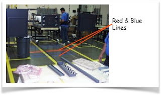
In the 2nd photo there are a series of horizontal blue lines and a single red line.  These lines correspond to the operational steps in the two Standard Work Combination  Sheets (SCWSs).  Note the SWCSs visible in the first photo.

Photo #2
The red line indicates a break point: a changeover, from one operator’s SWCS to the next.  That red line means that operator #1 must be finished by that point, and that operator #2 must begin.

The blue lines in the 2nd photo correspond with the time of each operational step in the SWCSs.  These lines allow the operators to glance at the floor while working.  They are looking to see if they are ahead or behind pace.  If they fall behind, they know they need to catch up.  

A missed handoff at the red line will mean that the Cycle Time (CT) will be greater than Takt Time (TT).  That’s a very bad thing.  Do you remember why?  I discussed it in my post on Takt Time.  If you’re not sure, it’s a good time to refresh.